Monday 28 March 2016

Further random low poly testing - James McAndrew Environment

We are in a weird subdued moment as a team. Due to unforeseen circumstances we are again unable to make the level that was originally designed and have to again redesign the level to fit, not having most of the scripts that would make the game... a game. While i wait for a new design that matt has taken under his wing, i thought i would go back a look over parts of the project.

I looked at the lo polys that i had and while i am some what happy with what i have made i know that i could produce something that fits the higher poly much better. This meant going back into Zbrush to review the high. Thanks to a lesson we had with phil i have a much better idea as to how to produce a fitting low poly. Essentially i took the high poly model that i have and decimated it until i was under 2k polys, i then took the decimated mesh into maya and cleaned the mesh up a little. Merging verts and deleting unseen faces meant i could get a mesh that was a much better fit. The cost of this better lower poly mesh means that it is a lot higher than the original mesh i have now.   


This is the newer, better low poly that i may be tempted to use (with a quixel texture slapped on). Looking straight on the meshes look relatively similar, the occlusion really brings out the gaps between the bricks. However the real different comes when looked at the mesh from the side, which is what the player will be seeing in the game. Here the bricks actually have some depth to them and doesn't just look like a flat plane which they do as of now. I really do like this way of doing the low poly and think that it is a much better way of doing things, at the cost of more polys, which is why i many not be able to do this. 
Another thing that i hadn't accounted for when redoing the low poly is that these meshes may not fit together as well as the current meshes do. If i have time i will defiantly do experimenting with this more.   

----------------------------------------------------------------------------------------------------------------------------------   

Thursday 24 March 2016

Level Redesign (Labyrinth) - Matt Glen (Concept Art)

Owing to time constraints and concern about the feasibility of some of our original goals for this project, the group decided to attempt to restructure the level into something more maze-like, taking the emphasis away from the combat aspects of the game (over which are hanging some question marks at the moment) and focusing more on evading enemies. After deciding on a overall layout of the map, the three distinct rooms and connections, I set about coming up with a concept for the internal labyrinth. Below you can see the original sketch provided by our Game Designer and then my design underneath.


The idea with this layout was to have a functional maze that could be slightly confusing and misleading at first, but would ultimately have multiple possible routes to the end destination. I began sketching in rough partitions and quickly established that it made sense to have three routes through the maze. I also knew I wanted to include the cell block design in there somewhere, as this had already been modeled, along with the starting platform which is a reworked version of my initial design for the last room of the game. Once these things were established, I quickly jotted in some example enemy placements to block the player's route, and marked in a start and finish. This was all done quite quickly, but it was necessary to get this to our Environment Artist as soon as possible to give us a chance of putting all of this together in time. Hopefully this new design will enable us to ensure there is a functioning game working by the end of the project, even if parts of the combat or other elements do end up not making the cut for one reason or another.


Coding - Cover Test - John Howard

Task

To try create a basic cover AI

Overview

I wanted to try and push towards creating a cover AI script. One that would allow me to, with altering the golem scripts, set up the skulker. I was very confused on how to approach this to begin this and so had to look at many different videos to get some ideas.

I began to piece together the notion of using nodes to act as cover points and thus I began coding. Firstly I set up a main cover holder which would be the main body of cover. For example a wall or rock. I created a tag for these called "Cover". I then created a cover selector script on the AI test cube. What this script does is firstly create an array and store all objects tagged cover. I would want to change  this to an area around the AI so the array would constantly be getting filled and emptied. However for now this will do. Using an InvokeRepeating function I force the AI to chose the closest piece of cover at any one point.
Under each cover game object are numerous child Nodes each node has a cover checker script on it. Each has a goodcover bool on it. This bool is turned off when a ray from the cover to the player is not obstructed and turned on when the node cannot see the player. The selector script then fills up a node array with the selected covers child objects, the nodes, and selects the closest node that cannot see the player and moves there. See video below.

Thoughts

This is a very buggy script that needs multiple iterations to work better with many different things needed to be taken into consideration. However I feel I must leave this script and function for now and fully focus on doing a final set of iterations for the golem and make that one as good as possible. However I believe I could come back to this and make a cover script that works much better.

Wednesday 23 March 2016

Character after Quixel and completed character

Above Is my a render I created within Quixel using the baked maps received from xnormal.
Not Finalized, the above render shows an experimental colour way for the main characters items that he has equipped. The ability to play around with textures quick and frequently through using the workflow within Quixel meant that I was able to play around with many effects on all parts of the character before I found the one that believed to capture the original concept the most.
In order to apply different textures to different parts of the model, I used the colour ID map that I showed in my last post to apply a different texture to each colour on the model, this meant that the green trousers underneath where able to have more of a cloth appearance to them, and the bracers wrapped around his wrist where able to look more stone like.


Going back into quixel again with a better idea of how we wanted the character's clothing to look, i was able to create the finalized character you can see above, rendered in Quixel.
I added a bit more dirt and scaring on the skin texture in order to make him appear as more like he's been kept away in a dungeon for years, I then because of this ensured that his clothes where not as clean as they appeared in the previous render. 
I then added a basic pattern to the texture of the trousers that was already a dirty teal cloth texture, this then gave the effect to be wearing printed trousers which added to the authentic feel of the character.

Im very happy with the final outcome of this model. Putting all my work together in Quixel is always my favorite part of the workflow, as it breaths a lot of life into something thats been grey for most of the time that I have been working on it. Working on this character also made me more proficient in my use of applying separate textures with the use of colourID's, being able to apply them all to the same model on the same texture sheet is something I can use to my advantage when i come to creating a character again. 


Main character Textures

Albedo

ColourID

Rather than the traditional approch of applying my colour ID maps within Zbrush and then exporting them out, I instead painted my Colour ID map within photoshop instead, over a UV snapshot of the models UV's. I did this essentially due to my lack of experience within Zbrush at this present time and I wanted to ensure that I could get my finished character model textured as fast and efficiently as I possibly could.

Gloss

Normal

When it came to creating the normal maps for my model, I was force to play around with them a bit in photoshop before they where as accurate as they are now on the model. this is because, when I was baking all of my characters objects together within Xnormal, parts of the models would bake on to each other, which obscured the model. For instance, my first normals came out so that the bracer around the neck was baked onto the back of the characters neck, and the rope around his waste could be seen on his back. So what I did to avoid this was bake each object separately and then overlay all of the separate normals within photoshop so that they would all be mapped out correctly in the uv's but not have any of the previous baking issues that i had before.

Specular

Finished LowPoly model and UV unwrap


Here I have shown the completed Low Poly model of our games main character that I created for the High Poly Zbrush model to be baked on to.
I created this low poly model by exporting out a decimated version of the high poly model that i created in zbrush so that it wasnt to high poly that it would make maya run to slowley. I then imported it into maya and began creating my low poly model by quad drawing around the model.
As you can see the character is still made of a few separate models. The body, bracers and folded jacket are all separate so they where all given their own low poly model. This was done as a request by our animator so that he could make the bracers appear to move while he is running rather than them being static and stuck to his body. 


Here I have a screenshot of the main characters finalized UV layout, ensuring that there are no obvious seems that would obscure the textures when they are put onto the low poly model. I do realize however that the way I have layed out my UV's means that there will be a seem that goes straight down the middle of my models face, I did however make a decision to put the seem here instead of on the back as I considered that the player wouldn't ever be seeing the face of the character directly as the game is being played in first person.

Finalised Zbrush sculpt of main character

Coming back to the main character model in Zbrush once again, I believe that this time around I managed to capture as realistic of a representation of the human male muscle anatomy as i possibly could. With this being the first ever sculpt I've made within zbrush, of an organic model that is anyway I am pretty happy with the overall outcome.


Above are then some screen shots of the character completed with all of his clothing and items equipped. The bracers on the neck and arms are supposed to be made of a mixture of stone and metal, so I tried to show that with the contrast of smoother planes next to the more bumpier like planes that have a lot more cracks on the surface.
You can also see in these screen shots the scaring that I applied on over the characters skin, from where he would of been whipped and tortured within his imprisonment in the dungeon. I have then also finalized the folded over jacket that our main character wears around his waste.

Overall I am very happy within the final outcome of this model as it leaves Zbrush to go onto to process of creating the low poly model and later baking the normals within Xnormal.
I think now that I have the experience of creating a more organic humanoid model within Zbrush, any future work I create similar to this will be able to be completed faster and with more accuracy then the amount of time it took me to achieve this level of accuracy with this character model.


Tuesday 22 March 2016

Environment Redesign - James McAndrew Environment

Due to recent meeting in the team. The environment is a lot simpler than previously designed, which i am ridiculously happy with as there is no way that i could do everything that needed to be done in the time that i we had left. The new level design also meant that i could just use the assets that i had already modeled. The redesign was essentially the same level just a more condensed version. The reasoning for the redesign was that we realized we had been a bit too ambitious and the game was going to be too difficult to complete form a design side in the time we had. As i am the only environment artist i don't think i could have completed everything we needed and completed my other projects in the time frame.


The environment so far (unlit and untextured) is looking pretty good so far. As this isn't 100% finished this isn't the final look of the level however it will give a rough idea what the finished level will look like.


This also allows us as a team to properly test the level with the actual meshes that will be used. All that needs to be done is  to combine the movement, character and camera coding as well as the AI code into this scene so the testing can begin.

----------------------------------------------------------------------------------------------------------------------------------

Saturday 19 March 2016

Tiling texturing - James McAndrew Environment

For the flooring i wanted to do something a little different. Instead of having loads of modular pieces and joining together in engine, i decided to just make a group of tiling floor textures. For the normals i make the a tiling meshing in zbrush and rendered out the normals and ambient occlusion maps. This wasn't that difficult to do once i knew how to do it. This was then just projected onto the floor meshes that i already had.


I wasn't overly happy with the result, solely because the normals look to be overly strong. However this didn't really seem to be a problem once projected onto the meshes.

Friday 18 March 2016

Level Redesign - John Howard

Task

To create an achievable level design. It has been established that the current level design is way too much work for the environment artist to do at this time.

Overview

Although for this project I am not a level designer I thought I should develop a level and get the environment artist started on it due to the simple fact that it needed to be done and it hadn't. I created one major room where a crystal and statues will be located. Upon interaction with the crystal the statues will activate into the golem AI basically creating a battle room. This would mean that even if this was the only room to get done we should still have gameplay as long as the other coders have finished their environmental code. I also included two other rooms and a corridor that can open as an end level area.

Thursday 17 March 2016

Further Environment Details - Matt Glen (Concept Art)

Here are some further little details to help inform the modelling of several rooms and props. First, the Crystal Room, which needed several details fleshed out a little more.

Crystal Room

Below are several sketches taken from the first concept for the room. I wanted to lay out a simpler depiction of what certain details actually consisted of in terms of form and structure. The simple column here was used to plan out some variants on the initial single pillar in an earlier post.


From here I started to quickly sketch out plans of other objects from the room and how they would sit from different views, including the alcove, crystal and roots.


These images are not immensely detailed or technically strong, but they act to give a more three dimensional view of the room and what sits within it. Hopefully these should be enough to give a clearer idea of where everything goes and how it should be modeled.


Screaming Cells

For this room, I first did a vertical plan to see how the room would be put together in a modular format by our 3D artists. The layout is very simple and repetitive, and should easily come together into a larger area.


I next did a quick illustration of what the inside of one of the little, light-emitting cells might look like. I wanted to keep it pretty simple so that it could be copied and pasted to make multiple cells without needing many changes, and I also tried to keep with the grotesque faces theme that this area of the level has a lot of.


Once these ideas had been run past the team, we decided that the room at the end of the cell block should be redesigned into a smaller chamber in which a crystal would hover.


This gave the room more of a purpose, as well as simplifying the layout of the room to eliminate completely superfluous spaces that would add very little to the game experience. This room is pretty simple and modular, but once it's put together in the final game with lighting, it should be quite an effective and imposing space. 


Threshold Steps

This room was fairly straightforward and self-explanatory from the initial illustration. It consists of a circular, elevated platform connected to a bridge. I put together this quick side view to give a better idea of the dimensions of the space, as well as a view of the entrance that leads to it. Other than this, the only other objects in the scene were more Gothic face-lights, which there is already a separate design for that should do the job.


This room should look pretty good once it's made, and makes for a very dramatic final stage on which to end our vertical slice. It'll be really interesting to see how these designs are adapted into 3D and turned into a real space. Hopefully they'll feel connected and part of one larger theme, while still having their own identities and atmosphere.

Tuesday 15 March 2016

Some UI Concepts - Matt Glen (Concept Art)

One idea for our game is to have the UI appear on the actual character, rather than as an overlayed image on a HUD. In order to have this work, the character needs to be wearing some type of collar or brace that, on top of the magic-inhibiting bracelets he is already wearing, holds back his power and indicates his health. Here were some ideas for what this could look like.


These concepts probably won't make it into the final game, especially the overly complicated health bar, but it's good to try out different ideas before settling on a final one and testing out options. If I had to choose a favourite it would be the first, as it seems the most simple and the health bar reads fairly well on it, however they all have slight issues with how easy it is to actually see the readout on them. It may be that we need to revisit how we actually display the health, and there at least needs to be a larger and simpler readout on the character that can be read from a third-person camera.


Saturday 12 March 2016

Coding - Golem Model and Animation Setups - John Howard

Task

Import the low poly golem model and set it up to work with the AI scripts.

Stage One - Golem Model

Importing in the Golem was the easiest part our animator had already attached the rig to the model so when it came into unity it was all set up. The only element I had to change was to make the rig humanoid. I think in future custom rigs would be better specially for creatures however this was one of the first rigs our animator had done and it works really well.

Stage Two - Animation and Animator

Bringing in all the animations so I has access to them seemed like the logical first step. I had to change all the import settings to act on a human rig again and the import for movement animations to looping. I then had to create a custom blend tree. I used my original iteration of the ethan AI to work this out. However we didn't have as many animations as needed to create a smooth movement. I shall ask the animator of the group to create some shorter or even stationary turns. But the blend tree works really well for the first animated setup! In regard to the actual animator setup all I did was make the movement into the entry state and then the same bools from the the cube AI with a combat state which had no movement and the two attacks coming off that.

Stage Three - NavMeshAgent to Animation

The next step was to get the golem AI to use the animations in the level. To do this I have to try and take values from the nav and feed them into the animator. I have two floats currently within the animator which control the movement blend tree. Turn which is the x value, and Forward which is the z. I was really struggling with how to set this up. So with the tecaher's assistance we went with  making each float equal to nav.velocity.x/z. Now whilst this works its rather buggy the AI spasms out quite a lot due to this and even has trouble stopping so I will have to research more into this and come back and develop a script just for this nav to animator conversion.

Friday 11 March 2016

Environmental Assets Pt.2 - Matt Glen (Concept Art)

Continued on from an earlier post, here are some further asset designs to fit into our game level.

Crystal

At least one of the rooms should contain a mystical glowing gem stone. Below are some ideas about what that could look like.


The concept on the right is a more standard crystal type of structure, which is fairly recognisable from the off. The left hand image is somewhat different, but not particularly clear. Someone remarked to me that it looks like a squid. This is not ideal. One piece of advice about creating concepts I hear often is to ensure that a design is easily understood within a matter of seconds, and so it seems to be a good rule of thumb to avoid going with an image that does not achieve this. The right-hand crystal is more obvious and works off of previous design shorthand visible in other games to tell the player exactly what the object is. The idea of it floating and glowing should also draw the players attention to it as a usable item pretty immediately as well.

Sarcophagus

Another object that should work well in the environment is a sort of small tomb that could act to divide up certain larger areas and add interest to the scene. In my first sketches, I decided to make this a fairly simple shape for the modelers, so that it could be quickly made and implemented, and potentially be made into multiple variants quite easily. I also included a human figure atop the sarcophagus, however, somewhat echoing the forms of ancient Egyptian coffins and making them more imposing and foreboding.


However, almost immediately after completing these drawings, I realised that in order to sculpt a decent human figure for the tombs, the 3D artists would need to spend an inordinate amount of time working on this small set piece, which completely defeated my original intention for the asset. I quickly began another drawing without the human figure, and also added a bit of damage and plant growth to replace the interest.


This should hopefully look quite good once it's in game, and provide a bit of cover-like scenery to the level.

Roots

One idea for the cathedral-like Crystal Room is to have a series of tangled roots dangling down from a shaft in the ceiling. Modelling these should be fairly straight forward, as they are only there for visual purposes and don't need to be amazingly detailed. 


Three twisted roots like this should look fairly effective and set the mood pretty well. While only a simple illustration, it should be enough detail for a simple model to be put together to drop in with a basic texture. Hopefully for only a small amount of work this should look quite good when in the game.


Thursday 10 March 2016

Dungeon Environment so far ... - James McAndrew Environment

 I have mostly been working on the dungeon part of the level, as this is the part of the level I am most happy with and most exited to work on. Its been a bit of a pain to get to this stage, partly because i had to redo most of the work i have done and partly because this is the first time that i am doing a proper modular environment and i wasn't really sure how well it was going to work out. As it stands i am pretty happy with the outcome and think that as a first attempt i have done a reasonably good job and am pretty happy with what i have done so far, although there are still some major parts that need fixing.


Although i have only completed the walls for this environment i think that when light properly and textured properly, i think that it will get a good representation to what Matt Glen (main concept artist) has drawn and concepted. 


Some of the major problems that need to be fixed and tweaked are the areas where two different meshes join together. The problems with these areas are the occlusion maps. I did do a past over these and add occlusion to the very edges where there was none, this worked well but i think these areas need to be refined and tweaked a little more. Some of the high poly models also need a little more work as well to make sure the fit the low poly better as there are gaps and the moment.

Despite this i am happy with the work that i have done so far and will do working more on this part of the environment to make sure its the best it can be.

--------------------------------------------------------------------------------------------------------------------------

Tuesday 8 March 2016

Golem Movement - Jack Schular Animation/VFX


These are the final Golem movements given to the AI coder. The golem was being driven by a nav mesh agent so would have to take root motion into account unlike the character animations. I wanted the Golem to move mainly through the power of his arms. I focused heavily on the animations of the shoulders and making them move with shifts in weight. The run was the most challenging animation to make. I attempted to model it off of a Gorillas run where the left side meets the ground before the right side.

Monday 7 March 2016

Coding - Sight Iteration - John Howard

Task

Create a sight system that allows peripheral vision.
Stage One - Initial Ideas
I spent a while before coding drawing and writing up diagrams like above trying to work out what kind of angles I needed and how I could approach the code. Researching into the unity API and forums I found out that degrees over 360 don't exist in world space. There are just 180 degrees on both side. So I need to cast out the angle comparison in the forward direction To force the AI to only raycast on the front facing side.

Stage Two - Raycasts

I decided to create a distance called raycast system rather than a collider based one. This means the sight doesn't require a bool to activate it just activates at different distances using if statements. Each if statement contains a cone of vision and a debug.ray of a different colour to allow me to test in the scene view when a certain part of the vision cone is being called. By giving larger widths of vision a smaller distance I can start giving the AI some peripheral like vision. I decided to create this script on a static test cube to just be able to see how the sight debugs changes, as seen at the start of this video. Once this was working correctly I put the new sight script onto the cube AI.


Thoughts

I think this script turned out really well. With a little bit of API raycast research I was able to set up an original functional script and get it calling the correct parts of the AI states. The extra cones of vision really help the AI seem more intelligent and reactive.

Friday 4 March 2016

Modular Not Very Modular - James McAndrew Environment

With most of the modular dungeon walls modeled and mapped (-textures). I started to piece everything together to see how it looked and all fitted together. The purpose of building an environment now, although the layout isn't really what we want, was to see if the modular pieces fitted together properly. I am made everything in Zbrush and found it easy to get things to be modular as i could just build everything off everything else. This test worked a lot better than i thought it would because i found a number of problems with the meshes and the modularity of everything. The main problem was that WallCorner02 wasn't modular with anything. As i just used existing pieces i had actually made the mesh backwards. This was an easy fix as i just had to rotate the wall parts around. This made the corner modular again.  


The other problem i had when testing this section of the level, was when joined together there where a number of holes and gaps in between the different meshes of the low poly. This was a problem with the low polys not the high poly. I am trying to fix this by redoing the low poly and having them a lot more square so hopefully there will be less space in between the meshes and fit together better. 
I'm pretty happy with the look of this test though, the brickwork works well together and even though the texture is just a internet found titling texture, it does give an idea as to what the final texture looks like.


The final major problem that i had was the joining together of certain parts, the meshes look very separate from each other and don't belong together. Hopefully this is a problem that will be fixed with the redone low polys but only time will tell. 

----------------------------------------------------------------------------------------------------------------------------------

Character Spells - Jack Schular Animation/VFX


I created a bunch of  spell animations for the character controller for better feedback whilst the characters spells would be coded. These animations would need to be able to be blended in to movement so I tried to keep only the upper body moving where possible and where it was not I wanted to create a faster animation. The spells were created through acting out how I thought a fireball or teleport spell would look and re-creating it through keyframes.

Thursday 3 March 2016

Environmental Assets Pt. 1 - Matt Glen (Concept Art)

Another part of the game that needs designing are the objects and set dressing that will sit throughout the level. I already knew that I needed bookcases, pillars and odd faces that emitted light, and so this is where I started.

Moodboard

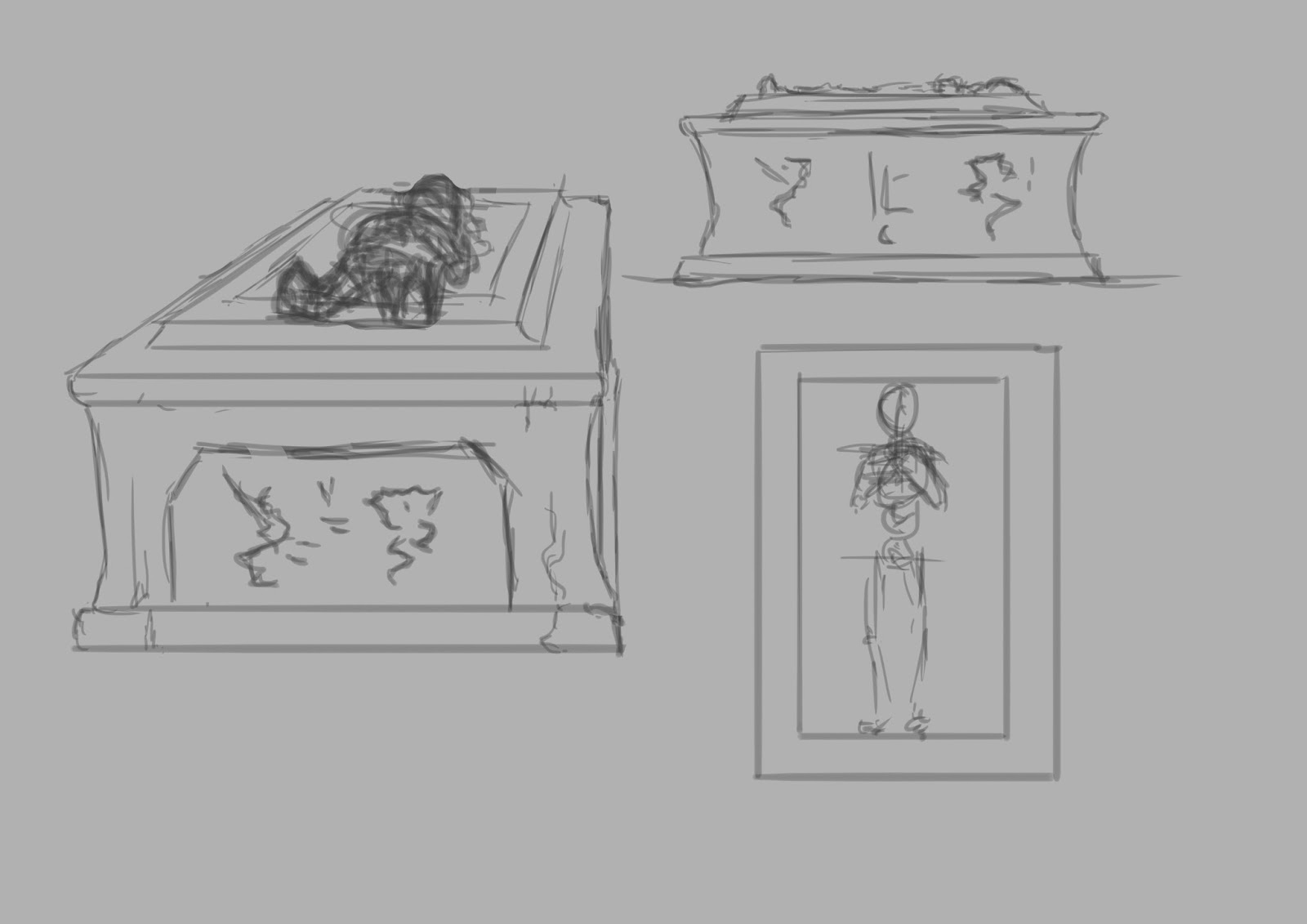
I felt it would be beneficial to gather some references first in order to inform the designs. I put together the following images, incorporating columns and other relevant things in order to generate ideas. I quickly felt like implementing some kind of sarcophagus or small tomb would add to a sense of age and morbidity.


Bookcases

I began with the most simple object, drawing out perspective lines, sketching out the rough form and then painting.


The offset in the centre of the cabin was an accident, and I'm not entirely sure how it came about, but I don't believe it ruins the design. The lighting works well enough to show the object well, and I've added little cobwebs in between shelving to indicate age and lack of use. My next step was to edit this image and create a smaller version.


This didn't take too long at all and was mainly a sort of cut and paste job. The main point of this was simply to see if a very basic smaller version would look interesting enough next to the larger unit, and I think it works well enough for use in the game. These are not focal points or centre pieces, and are meant only to litter the environment.

Columns

After this I moved on to columns, which I adapted from a series of drawings I'm working on that should help our 3D artists to design the Crystal Room. More on that in another post. For now, I combined multiple arches to get a feel of how the objects might work together in the space, and be used to direct player movement and enemy direction.


Here you can see a couple of pillars joined by a sort of barricade object, as well as a broken column set piece that would add a little variety to the set dressing encountered by the player. I also had a think about how the pillars might connect to the ceiling, which I had not actually considered until this point. I came up with the below image:


While a little exaggerated, and perhaps burdened with superfluous embellishments at the top, I think it looks at least somewhat grand and classical, which had been my intention. This design is perhaps not perfectly in-keeping with the overall aesthetic of the level, but I think it does work and shouldn't draw too much attention to itself. 

Face Lights

Eventually I moved on to the part I was least sure about, the grotesque, Gothic faces that I wanted to adorn the walls of certain parts of the level and emit ghoulish green lights. I wanted to adapt the design a little from the original concept that came from the Screaming Cells room into a more haunting, pained expression. I also had to consider the quality and brightness of the lights. I began with an iterative process, painting first a rough head and trying to pin down the expression, and then gradually adding lights and details.


After getting to this stage, I blew the image up to a larger size and began painting over it with more details, textures and lighting.


I'm fairly happy with this outcome. I think I got the face to look roughly how I wanted it, although perhaps it could have contained a trace more fear; facial expressions are immensely complex and subtle, however, and I doubt I could ever capture exactly what I was after. The lighting is fairly dramatic and the glowing orifices are pretty creepy. I decided with this piece not to use a cracked earth texture, as I had done previously with the Screaming Cells concept, and instead painted this in myself. My use of textures is often haphazard and slapdash at best, often looking flat and alien, not a part of the scene. Until I resolve these issues with my use of texturing, it may be best to continue working in this way, even if it makes the work slightly more difficult and time consuming. 

For now, I think these assets do their jobs and should lead to some interesting objects in the finished game.