In this project I wanted to try something new, on a personal level. I had already done level design and coding in the previous year and in the first term project, I was the environment modeler. For this project I specifically wanted to take a step back from any design and focus on character modelling. I wanted to try and replicate the scenario I would face in a real studio as closely as possible if I were tasked to doing a character model. I weighed in with a few conceptual ideas at the beginning of the planning phase, but wanted to see if I could create a model from purely the concept artists and the lead designers wishes without influencing the design too much.
I really wanted to do lead character as I wanted to get some human figure modeling practice done for a project but I was also happy to do the enemies as well, as they were likely to be interesting shapes. Initially there were going to be 3 separate enemy models but I was tasked with completing the biggest and most important first to see how much time we had left. I found out that it was supposed to be a level ending mini-boss, standing around 20 feet tall and be the 'hulking brute' archetype enemy. It was to be made of a dark polished stone/glass like material with coloured lights emitting from many of the cracks. First designs had the appearance of a spectral mist with floating armour on top with the innards just as a pulsing light. I was moderately happy to give it a go but we ended up opting out of that design because it would be a far stretch of my talents having never learned any VFX before. It would probably had to have been mostly particle effects rather than a model. After a few design variations the concept artist and designer agreed on the following model, and I was given the model sheet below to work from.

For this project I wanted to use a zBrush workflow for the majority, and only use Maya to create the low-poly version. I started with zSpheres to get the initial basic mesh shape completed, always using symmetry to keep the mesh creation time as low as possible. Working from the left side of the concept image I created the mesh from the zSpheres. At this stage my main goal was to get the outline of the base mesh done as quickly as possible so the animator could start rigging it.


I created the overall shape of the mesh with the Move and Clay Buildup brushes and smoothed it out a bit. I used DynaMesh for this process to work quickly to create the necessary shape. I then used zRemesher to lower the poly-count a bit to export the OBJ to hand to the animator.


The animator then told me that in order for him to rig it properly he would need me to put it in the usual T-pose, extending the arms and the fingers. I did so by masking off areas and using Transpose tools on the limbs and fingers to straighten it all out for export again. This newly positioned model would end up being the base mesh.

With the base mesh in the animators hands I could then start working on the high-poly version fully. At this juncture I was doing a lot of thinking about the best way to go about creating the different sections of the model. My first instinct was to create a smooth under-mesh which would act as the emissive part, then I would make separate stone armour pieces on top. I decided against this method in the end because it was possible that polygons may be at a premium near the end of the project and this method would essentially create too much unnecessary mesh. The other reason was that the concept didn't have too many emissive parts overall so would have probably been a waste to create that much underneath. I looked up many tutorials and speed sculpts of how other, more experienced modelers created sectioned armour pieces. The two popular methods were extraction and panel loops from poly-grouping.
I decided to experiment and try the panel loop option as it did look very clean on high resolution meshes. I subdivided the mesh a number of times and used the Slice Curve tool to create the different poly-groups in the areas where the armour panels were. I did the lengthy and pain-staking process of hiding poly-groups then using the Slice Curve tool on the remaining visible ones until all the panels were the sizes and shapes I needed them. At the end I used the 'Mirror and Weld' function to make it symmetrical once again. This took a long time for an experiment. I was hoping it would work out alright, otherwise it was a lot of effort wasted.


After that it was time to see if the effort had paid off and started to panel-loop the mesh. It took a few trials to get the settings correct to get the lines to look like the divides were small and detailed enough. In one of the video tutorials I had seen one person add extra loops in when panel-looping the mesh, then using the 'Mask by Poly-Groups' option he used the Move brush to pull out the panels to create the chunky panel look. This was the method I wanted to go for, so following that method I started to pull out the panels. I noticed while pulling the panels out that the mesh was less smooth that I wanted, but had also learned about hard surface brushes such as Flatten and hPolish which I could use later to make it smooth again.

The panel-looping process came out ok - good enough to continue, but probably not the most efficient way of going about it. I continued pulling out all the armour pieces until I had the look that seemed closest to the concepts.


At this stage I was worried about being able to easily modify the separate armour pieces as it was all still part of one mesh. I decided to go through the different similar poly-groups and start grouping them together to create manageable pieces.

After all the big pieces were separated into different Poly-Groups, I used 'Groups Split' to separate them into different sub-tools. It was around this time when I noticed what a mess the panel-looping made to the edges of the mesh. I realised I would have to be very careful about moving things and reshaping the now separated sub-tools too much to avoid creating gaps between the sections.
I then went on to smoothing the chunky armour parts of the mesh with primarily the hPolish brush. This is where I found my second problem with panel-loops. When pulling the panels out, it leaves very low resolution edges and so cannot be easily sculpted without modification. So I went through another very pain-staking process here. I selected each of the extruded armour sub-tools and using the zModeler brush, I creased each edge to keep the corners and edges as sharp as I needed them. I then added multiple edge loops down the sides of each armour piece to add the necessary resolution before sub-dividing. This took AGES, but was a completely necessary step in order to flatten and smooth the armour pieces, otherwise they wouldn't subdivide with sharp edges and have weird crinkles along the sides when polishing.
After this lengthy step was done, I polished all the pieces to take out all the obvious bobbles. I also did some shaping to the face and spike areas on the back to make them hard-surface looking.


Next I created the faces for the shoulder pads using the concept image to get the shape as close as I could. To do them symmetrical I had to create a separate sub-tool and then re-position them later. I used the same technique as before, with panel-loops for the emissive areas, but this time I pushed them in slightly instead of pulling them out. This was a much safer and less time consuming process for these shoulder pads compared to the main body. I shaped the faces on the shoulder with the Flatten brush and used hPolish to make them look like they were roughly carved from stone.

I positioned the shoulder pad and then used Mirror and Weld. I then used the Topology brush and drew out basic rectangles on the legs to create the shape of where the skirt should be. This creates a very low poly block attached to the geometry it was drawn on. I separated it from the legs and used the Move brush to carefully ease it away from the main mesh into the position it was supposed to be in. I creased the correct edges and then subdivided many times and finally gave it a slight polish.

Next I created a sphere and I subdivided them many times. I activated radial symmetry and increased the count to a large amount. I then used the Dam_Standard brush to cut in, and also pop out a few parts of the eye to give it more detail. I then positioned it correctly in the eye socket and mirrored it. I knew the eyes of the Golem didn't need to move or be animated so I could just place them into position into the head. I tried to inset them just enough to recreate the slightly unnerving stare that the concept had.

I then started to add more detail to the model which would be seen on the final details in the Normal map. I again used the combination of poly-grouping, panel-looping and insetting certain details which the concept had to try and keep these parts as accurate as possible.

At this point I had some concerns over the shape and material of the skirt. I thought that if it was made of hard stone like the rest of the Golem, it would certainly be in the way when it came to animating the model. Either it would bend and look strange, or we would have to separate it and have it move as a separate entity which would create more work for the animator. I asked the lead designer and concept artist which direction they wanted to take it, and they agreed that the skirt should stay, but I should create slats in it so it wouldn't look so strange if it moved along with the model. Additionally due to the shape of the knee we added simple knee pads to detract from the possible warping of the emissive areas on the front of the knee.
I added some large asymmetrical damage in the armour, such as a big chip out of one arm plate, as well as chipping off the end of the nose of one of the shoulder pads. I did this detail at this stage so I could add them to the actual geometry when creating the low-poly, which was the next step.


I grouped the sub-tools together so they were just a few large sub-tools. The shoulders were one, the torso and arms another, the head another, the skirt, the knee pads and legs all separate. I then went about using the Decimation Master ready to export into Maya to create the low-poly.
In Maya I imported all the decimated pieces and started Quad-drawing. I had never done this process all the way through before so wasn't sure how it would turn out. I tried to keep to the accepted torso topology one would expect from a humanoid shaped model, but as I had imported it as a singular mesh, I had to account for the armour shapes. I ran into a hugely time consuming problem. The parts of the mesh which would be emissive on the final low-poly model would need to be outlined with Quad-draw. They were mostly inset and this made the whole process VERY fiddly. I don't know how long Quad-draw is supposed to take usually to get a neat low-poly model, but this took me a good few days of full time work to complete. Much longer than I anticipated, and much longer than I expected even after I had started. This fiddly problem combined with the fact the model has many parts that require geometry instead of just detail that could be contained in the Normal map, this was a huge time-sink.


I then tried to keep as normal face topology as I could, an due to the smoothness and simplicity of the face, and the fact it wouldn't need to be animated, it barely took any time at all.

I did the same process for one shoulder pad, the knee pads and the whole skirt, which wasn't symmetrical. I then duplicated each of the pieces of geometry and mirrored them across -X and combined. I then selected all the vertices which should be in the centre line and scaled them together and welded them for all half-pieces.
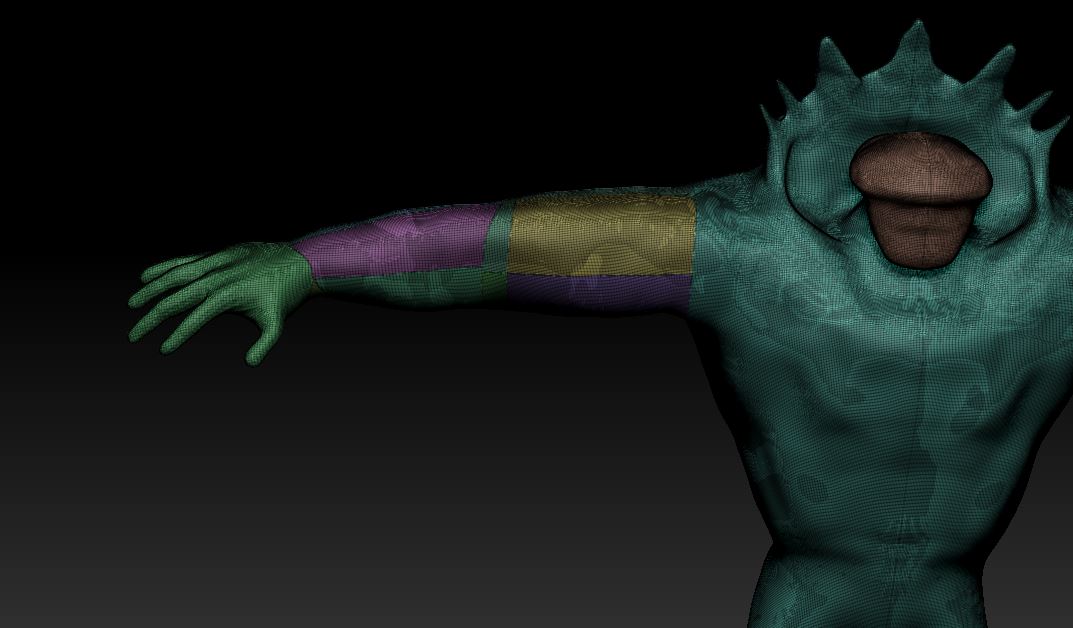
So with a full low-poly mesh completed, it was time to map out the UV's. The environment modeler had all the map limits planned, and so to allow the 5 maps I needed (Albedo, Metallic, AO, Normal and Emissive) I would need to fit the whole unwrapped Golem into a single 0-1 space.
With the symmetry tool active, I cut along non-intrusive edges and tried to separate all the UV's into manageable chunks while also attempting to keep distortion to a minimum.

To fit all the pieces into one texture sheet, I had to make compromises in terms of which areas needed the most resolution. I decided the main chest area would probably be the most visible to the player and gave them the largest areas. I then prioritised all the other areas to how visible they would be to the player and arranged them as efficiently as I could in the 0-1 space.


After that was finished I went back to zBrush to finish the high resolution detail. I used the MAH-Cut brush with a long lazy mouse setting to create similar grooves in the panels to those shown in the concept, along with some others to create interest on plainer areas.

I then needed to create the colourID map for baking so I filled all the sub-tools with the necessary colours. I then hand-painted the more fiddly emissive areas, many I did roughly (especially the small detail areas) which I would clean up in Photoshop before texturing.

I then did many, many bakes. Most were tests at 2048 to try and get the cleanest results. Going back and forth from low-poly, softening and hardening edges to see which came out best in the final bakes. The final maps are at 4k however due to being restricted map quantity.
When I was happy with the overall maps, I cleaned up the small imperfections in the normal map and ambient occlusion map. I then also went through and used the magnetic lasso tool to sharpen all the yellow areas in the colourID map to make it all as clean as possible. I combined all the separate bakes into one file in Photoshop and created an Emissive map alpha from the colourID map by using the yellow parts as a base. I then used layer styles within Photoshop to give the edges a slight fade on the emissive areas so when they light shines through in engine, it will be brighter in the middle than the edges.
I created a quick Unity test project to assemble the maps together with the model to do a final check to make sure it was all satisfactory. The colourID as albedo, AO, Normal and to test the emissive map was working correctly.


Next was to set up the QuixelSuite project. I imported everything and set it to a Unity 5 PBR metallic/roughness workflow. I added a light scratch pattern all over in nDo first, and converted it to normals so the stone texture wouldn't look completely smooth. Then in dDo, for the materials, I already knew the armour parts had to be a very dark and very reflective polished stone. I knew also that instead of black, the designer wanted a deep purple instead as it's a more 'magical' look. None of the presets were very good for what I was looking for, however in the legacy presets there was a glass preset I could use. I modified it enough to make it look more like a stone than a glass, testing a lot of different lighting conditions to ensure the reflectivity was ok.
For the connecting areas in between the emissive strips and the stone armour slabs I went with a concrete looking material to continue the magical rock Golem look. I modified the texture so it looked less dirty and had purple reflective tints instead. Below is the image from the 3Do renderer.

Next was time to export it all and do a final test in Unity once again. I read from the Unity tutorials that emissive textures can only emit actual light when the object is static, so I set up a simple scene, set the Golem to static, and set the emissive light colour to try to get a good idea of what it might look like in a more dimly lit area.


It looked great, but obviously the Golem wouldn't be a static object so I set up a quick demo scene with low intensity point lights around the Golem so it could appear like it emitted light in real time. The cool thing about this method was that when the point lights were positioned just slightly away from the model, the light reflects back off the stone surface and makes it look more authentic.

After this I sent the finished model and all maps for them to import and attach the rig to. Maybe we'll able to set up the actual Golem in the final game this way for the final build. It may not be possible as they have coded the lights to change colour with different stages of health that the Golem is at so it may be easier for gameplay reasons if the lights are positioned differently or are much brighter.
I learned a fair amount while doing this project, especially regarding hard surfaces on characters and the time-intensity of some of the stages. I learned lots of little tips and tricks, and the pros and cons of certain techniques. Techniques like organising a mesh through poly-grouping with Slice Curve, and things like panel-looping. Many tools which I hadn't used before this, especially brushes I have now gotten used to, like MAH-Cut, Flatten, Trim Dynamic and hPolish. I learned how to use Quad-draw fairly well, and by the end I was more efficient with it than I was at the beginning at least. I learned a fair amount about how to UV more efficiently with this model too. The limitations of only being allowed one texture sheet helped me in this case to optimise space as well as I could. It still isn't anywhere near optimal as there are small gaps around but better than I had done previously.
I have a couple of regrets from this project however. I felt a bit bad as I said I would help with environment modeling after I had completed the Golem but I barely helped my team out afterwards due to barely having any time and other projects still to complete before end of term. I have the problem still where if any part of the model isn't of a high standard I transfix on it until it is done properly and this costs me so much time. I need to learn to recognise when it is an ok time to leave something and that it won't even be noticed in-game. Examples of this for this project is the panel-loop restructuring and the Quad-drawing. For the former I could have easily just left it as it was, as most of the areas will barely be visible from afar when the player character is from a 3rd person camera. Like-wise for the Quad-draw, I think I made it far too high-poly for what it needed to be. Also all the intricate and fiddly areas that took so long to get right didn't need to be anywhere near perfect as they wouldn't be pretty much never be seen. They look great now, but probably at the cost of other areas. Luckily the team narrowed the games overall scope to be only one enemy and smaller level so it gave us modelers all less work to do. I'm not sure how I would ever had got it finished if I did have to make another enemy type as well.
I learned a fair amount about keeping animators in mind when making this whole model. I had never made a biological shape that was going to be animated before, and so I found myself thinking of the best way to make something so an animator could use it ok. Things like the joints and the skirt, shoulder pads etc. I made a lot of mistakes and I think if I was working with an experienced animator they may have given me much more rigid instructions prior to creation on how to make certain things properly. In the end I combined it all as one mesh as that is what our animator wanted. Others may have wanted it in lots of different smaller meshes so the armour could bob independently on top for example.
Following on from that, I think if I were to make this model again I would make it multiple meshes instead. I would have a base mesh like I had originally planned and create the armour on top of that as different meshes. There is a few different reasons for this. One would be that it would probably save me time (although at the beginning I suspected it would take longer). Quad-drawing over a simple organic shape would be much quicker, then I could perhaps even just use zRemesher to do the armour slabs and save a load of time. I could also just make the hidden mesh under the armour much lower resolution and would probably barely take any time to make the low-poly. Also, I wouldn't have the long process of cleaning up messy edges from extruding from panel-looping. I would probably just use the mask/extract technique to make the armour slabs and then manually polish them to make the hard edges. I would still use panel-loops but just to add details that show on normal maps, not to modify in anyway afterwards. Another benefit to making the slabs separate meshes would be that an animator could easily take the armour and animate them separately as well as the fact they wouldn't bend and warp when the models limbs moved.
Again another project has finished where I have felt like I wasted huge amounts of time by doing overly complicated techniques that could have put other areas of the game in jeopardy. Luckily it wasn't the case as almost everyone over-estimated what was possible within the time frame, not only myself. Having said all that, I know that I would do many things much differently if I were to make a similar model next time so it was still a valuable learning experience. I learned a lot of techniques (some I spent so long doing that I'm fairly proficient at now) and completed the workflow all the way through for the first time and it (mostly) went as planned. I now know how the whole process can go for future characters and have a much better idea of how each stage will go when planning the initial high-poly model.


