Moodboard
I felt it would be beneficial to gather some references first in order to inform the designs. I put together the following images, incorporating columns and other relevant things in order to generate ideas. I quickly felt like implementing some kind of sarcophagus or small tomb would add to a sense of age and morbidity.
Bookcases
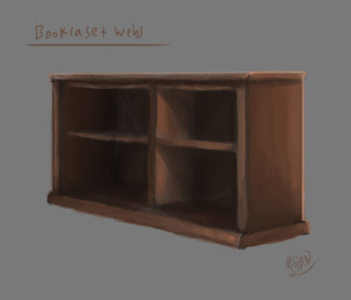
I began with the most simple object, drawing out perspective lines, sketching out the rough form and then painting.
The offset in the centre of the cabin was an accident, and I'm not entirely sure how it came about, but I don't believe it ruins the design. The lighting works well enough to show the object well, and I've added little cobwebs in between shelving to indicate age and lack of use. My next step was to edit this image and create a smaller version.
This didn't take too long at all and was mainly a sort of cut and paste job. The main point of this was simply to see if a very basic smaller version would look interesting enough next to the larger unit, and I think it works well enough for use in the game. These are not focal points or centre pieces, and are meant only to litter the environment.
Columns
After this I moved on to columns, which I adapted from a series of drawings I'm working on that should help our 3D artists to design the Crystal Room. More on that in another post. For now, I combined multiple arches to get a feel of how the objects might work together in the space, and be used to direct player movement and enemy direction.
Here you can see a couple of pillars joined by a sort of barricade object, as well as a broken column set piece that would add a little variety to the set dressing encountered by the player. I also had a think about how the pillars might connect to the ceiling, which I had not actually considered until this point. I came up with the below image:
While a little exaggerated, and perhaps burdened with superfluous embellishments at the top, I think it looks at least somewhat grand and classical, which had been my intention. This design is perhaps not perfectly in-keeping with the overall aesthetic of the level, but I think it does work and shouldn't draw too much attention to itself.
Face Lights
Eventually I moved on to the part I was least sure about, the grotesque, Gothic faces that I wanted to adorn the walls of certain parts of the level and emit ghoulish green lights. I wanted to adapt the design a little from the original concept that came from the Screaming Cells room into a more haunting, pained expression. I also had to consider the quality and brightness of the lights. I began with an iterative process, painting first a rough head and trying to pin down the expression, and then gradually adding lights and details.
After getting to this stage, I blew the image up to a larger size and began painting over it with more details, textures and lighting.
I'm fairly happy with this outcome. I think I got the face to look roughly how I wanted it, although perhaps it could have contained a trace more fear; facial expressions are immensely complex and subtle, however, and I doubt I could ever capture exactly what I was after. The lighting is fairly dramatic and the glowing orifices are pretty creepy. I decided with this piece not to use a cracked earth texture, as I had done previously with the Screaming Cells concept, and instead painted this in myself. My use of textures is often haphazard and slapdash at best, often looking flat and alien, not a part of the scene. Until I resolve these issues with my use of texturing, it may be best to continue working in this way, even if it makes the work slightly more difficult and time consuming.
For now, I think these assets do their jobs and should lead to some interesting objects in the finished game.


No comments:
Post a Comment